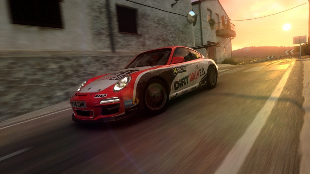
DiRT Rally 2.0 dares you to carve your way through a selection of iconic rally locations from across the globe, in the most powerful off-road vehicles ever made, knowing that the smallest mistake could end your stage.
Role / Experienced UI Artist
Studio / Codemasters
Platform / PC, XBox One, PS4
Software Used / Photoshop, Illustrator, After Effects, 3ds Max
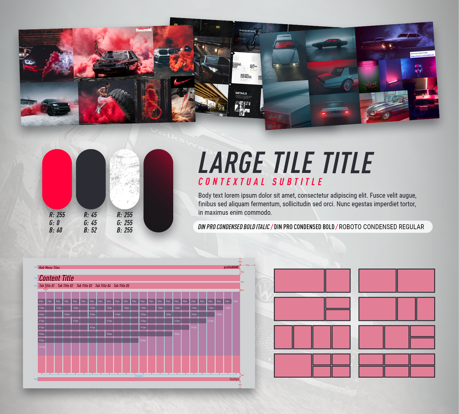
We wanted something in tune with the franchise, something that reminded the player of the previous game and felt like sequel but more modern and improved in every way.
I started creating moodboards and gathering references. I was able to guide the art style, settle the font, the colors and the main composition of the UI.

Our goal was a clean, floaty, minimal UI that sat and worked on top of the game. Smooth animations and particle effects to make the UI feel alive. An immersive transition from front end to game with an exciting loading screen.

The loading screen was a big task to tackle. We wanted immersion and information. Transitioning via a map/satellite shot which shows the route and relevant info like the number of sectors, elevation, time of day, etc. I created the maps, the typesetting, animations, everything needed for 6 rally locations (72 different routes) and 8 Rally Cross circuits. It was hard work but I am very proud of the result.
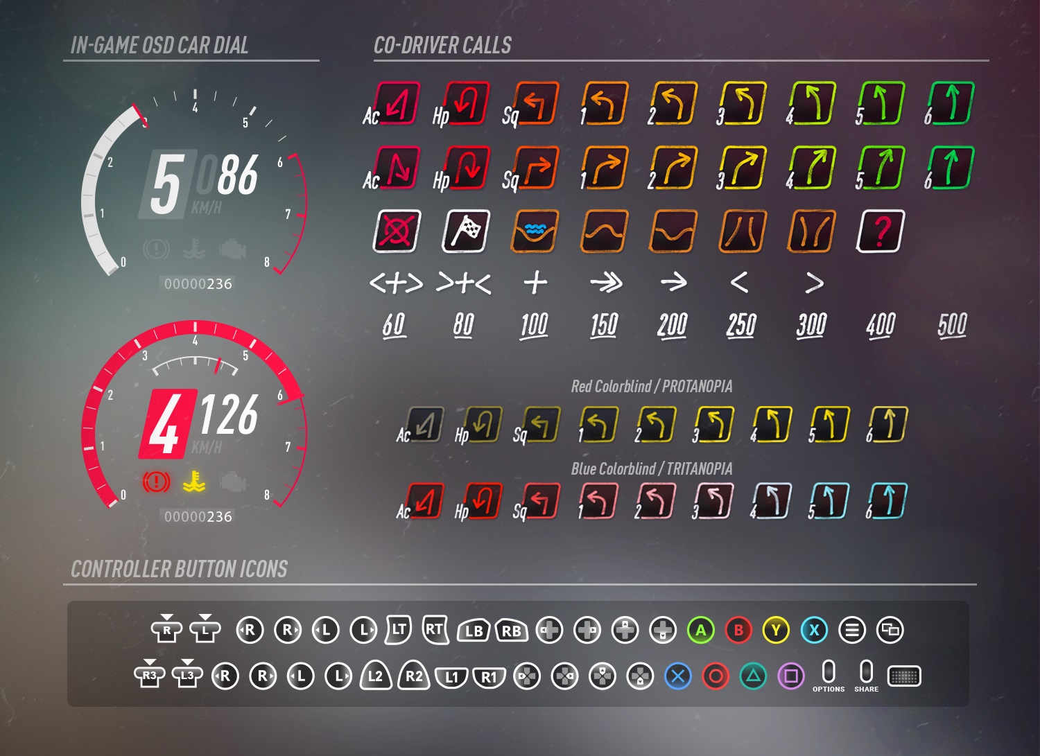
I designed all the components that appear on the OSD while you are racing.
For the co-driver calls, we wanted an analogue feel but not completely bespoke from the rest of the UI. I used an angled approach, a palette of neon colors that complimented our accent color and hand drew our font, mimicking the effect of a felt tip marker. The dial can adapt to any car (different shift times, revolutions, turbo).


In this project I wanted the UI team to have a good and direct communication with the marketing department.
I helped providing screenshots and templates for their social content. When it comes to the presentation of a game, UX starts on the store shelf.
I took the task to create the logo. Best approach was to leave the “DiRT RALLY” part to be the same as the previous game to be as recognisable as possible, and focus on the 2.0, the treatment and the colors giving it a diagonal scratch treatment.

Greetings from the DR2.0 team!
Thank you!