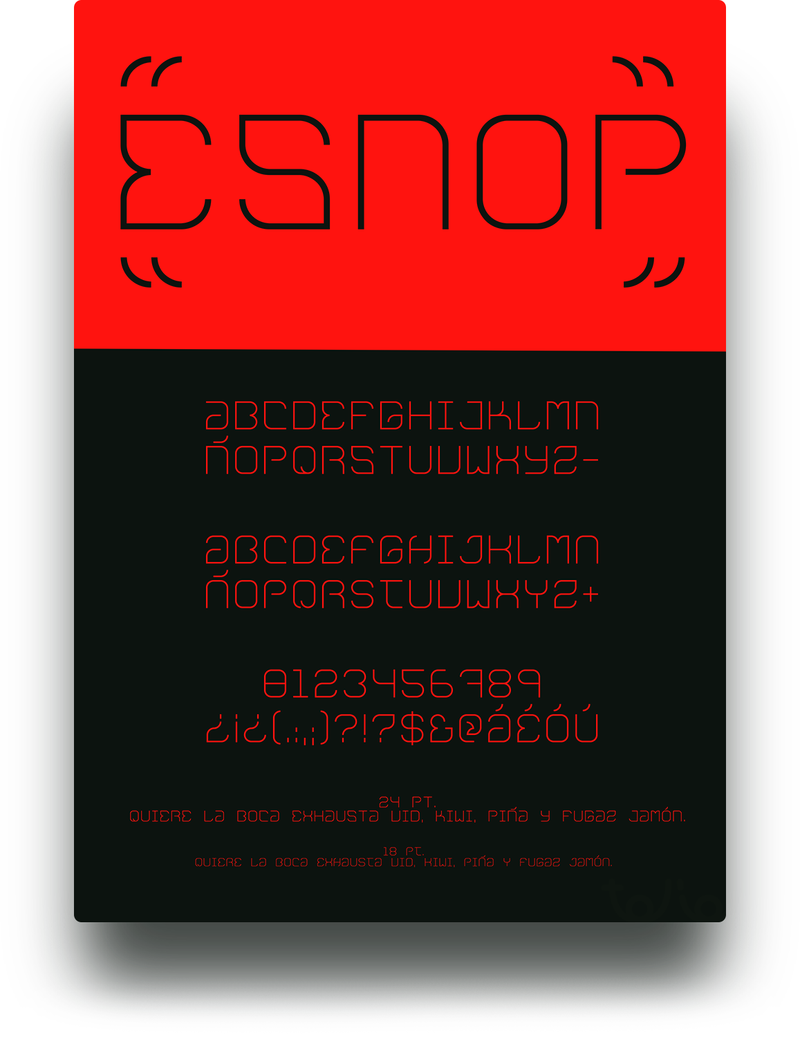
Light, san serif, monospace and unicase. A mix of sci-fi and nature. These are the features of ESNOP.
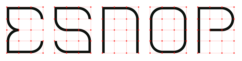
Without any references and a blank canvas I started developing the font. Built only with 2 shapes; a round corner and a straight line, all constructed in a grid of 4×3. With only those 2 pieces I've been able to create a full alphabet and set of characters.
Even though it is unicase, I decided to create different characters for upper and lower case, for aesthetic reasons only, to give a bit of variety and playability to the font.
Its mainly use is for display titles and headers, but it's still legible in small sizes.
Building a typeface was a truly rewarding process. I wanted to immerse myself into all the steps it takes to build a font, to understand and learn trough practice. From the first sketches, to using various software, font structure, etc. There is no better way to learn than to try and build something yourself.
Thanks!